How-to · 27 June 2025
Make your data smarter: unlocking powerful graphing
Actionable insight starts with visualization that does more than draw a line — scatter plots with curve fits, pipe diagrams with ISO flow lines, and site images scrolling alongside the sensor data they belong to.
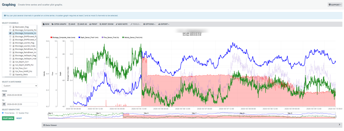
Operators and data analysts know that actionable insight starts with smart data visualization. In infinitii flowworks your data is not just displayed — it becomes a decision-making capability, in your browser, on any device, with no new software required.
Beyond static charts
- Zoom, scroll and navigate through very large datasets with intuitive controls.
- Compare multiple data channels side by side using time series graphing, and switch between tree and grid views.
- Customize appearance and axis options, save your favourite views, and add notes directly to data points.
- Export to CSV for colleagues who would rather work in Excel.
Advanced analysis
- Use scatter plots to reveal relationships between channels, and add curve fits — linear, polynomial, exponential, logarithmic, power, Manning or Froude — for deeper trend analysis.
- Overlay pipe diagrams with ISO flow lines directly onto your scatterplots for a contextual view of system performance.
- Link site camera images to your sensor data, scrolling through the time series while viewing the corresponding images in a carousel — useful for event validation and incident review.
Edit, flag, and trust your data
- Highlight and flag data points or ranges with quality scores or custom values, then use those flags in calculated channels.
- Create “edited” calculated channels without ever altering your raw data. Source data remains untouched, so data integrity is preserved.
See it on your own data — start a trial or book a walkthrough.
First published on the infinitii ai blog. infinitii ai is the company behind infinitii flowworks.
Related
Ready to begin?
See it on your own data
A walkthrough on your own sites answers the questions an article cannot.